For Jerusalem Design Week We Make Carpets team up with the Jerusalem-based graphic design duo Grotesca. Equally keen on patterns, colors, and no-nonsense communication, Eitam Tubul and Shira Glick of Grotesca Design have built up a rich portfolio of commercial and autonomous digital and graphic design. After two months of intense conversations, both live and online, these two groups have created works that communicate with each other.
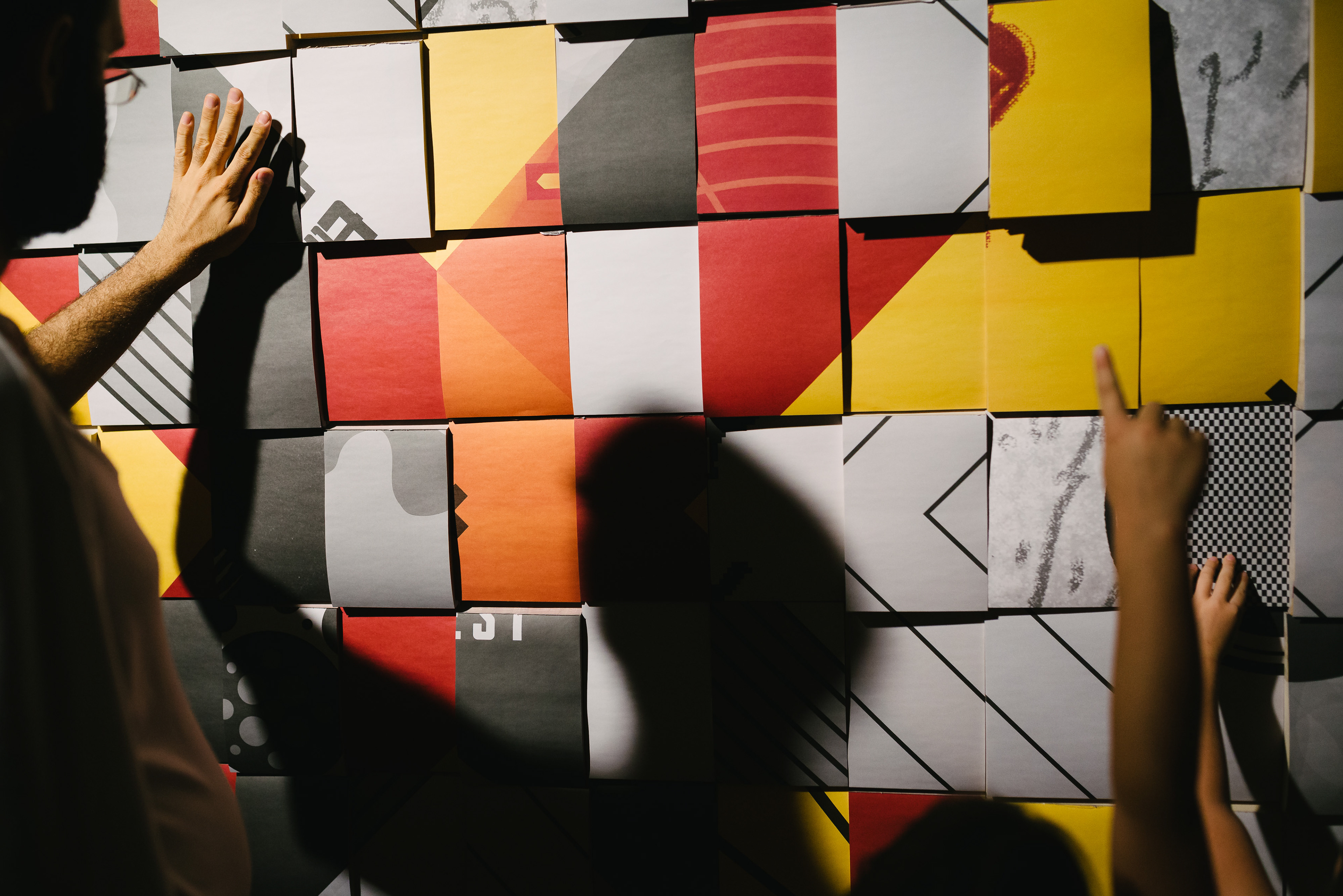
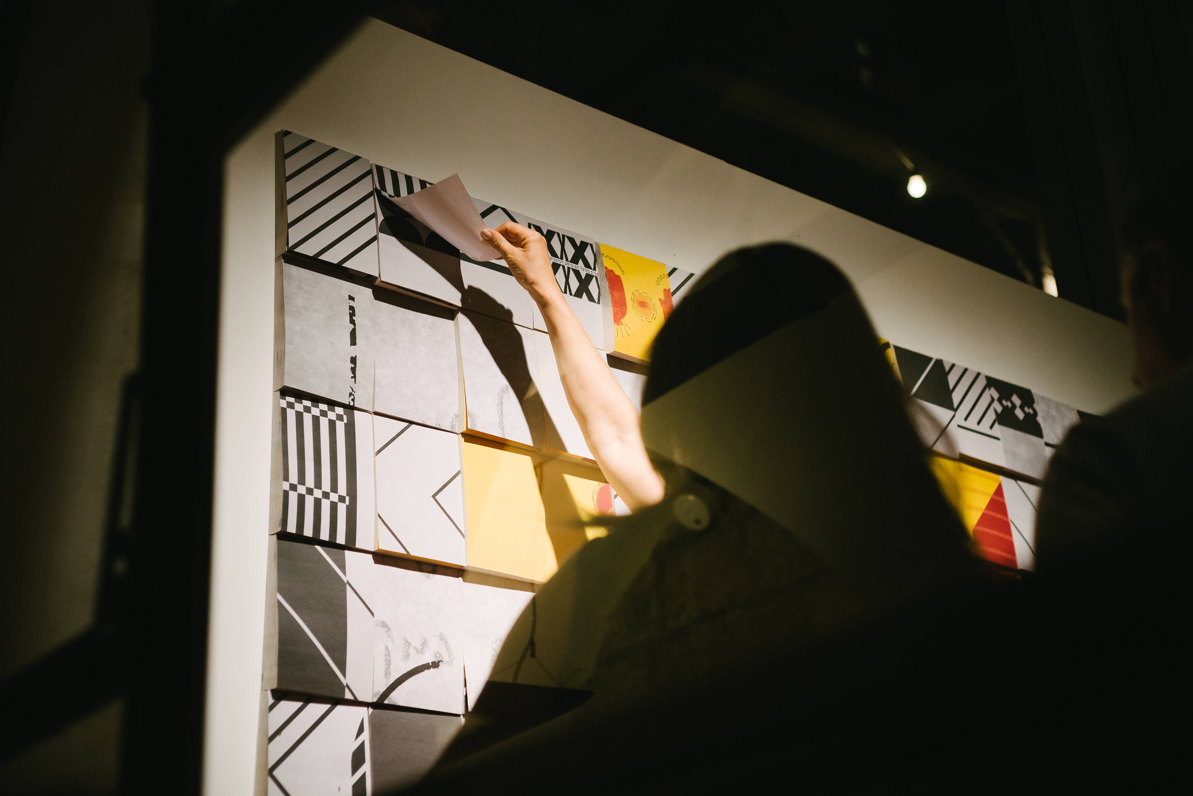
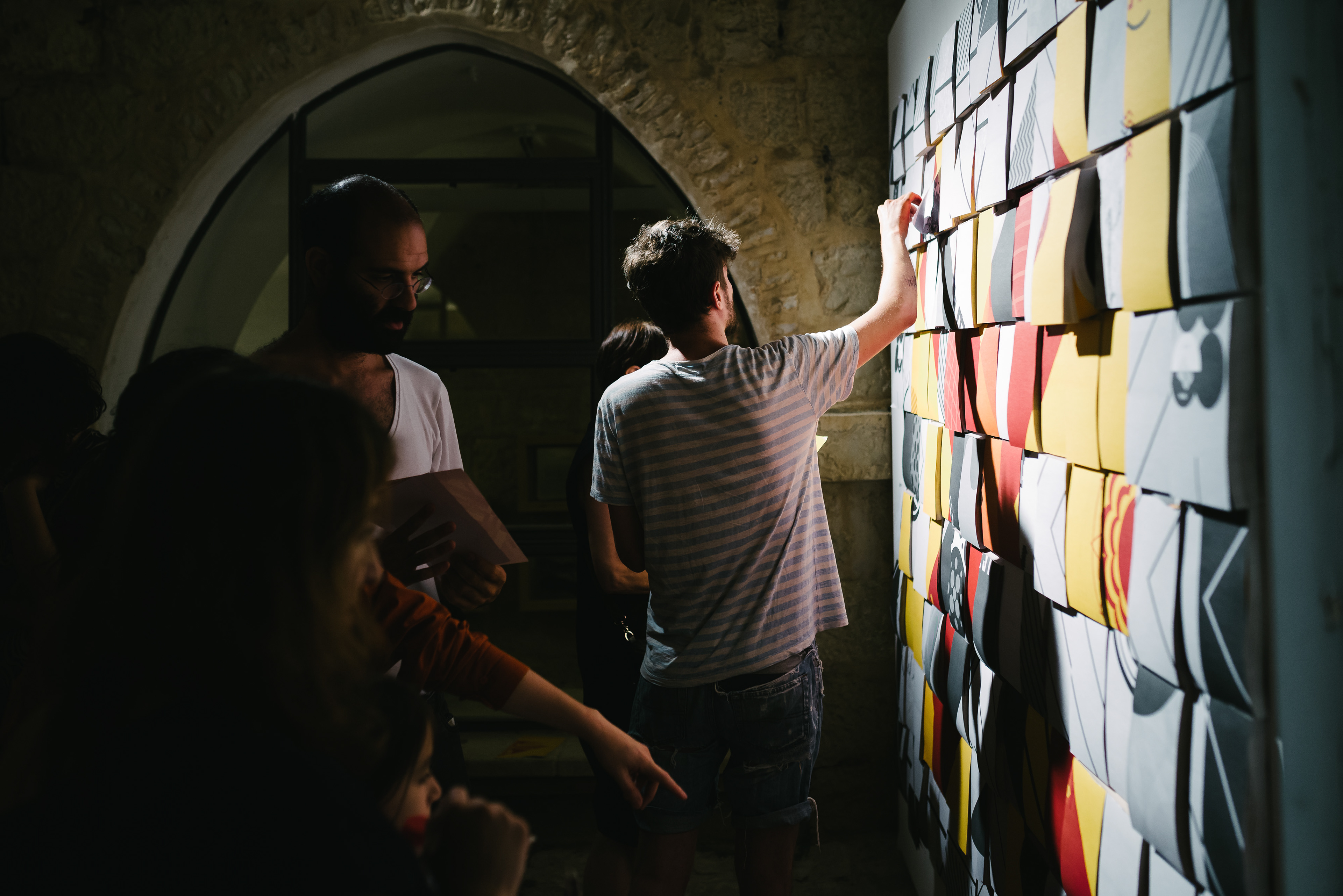
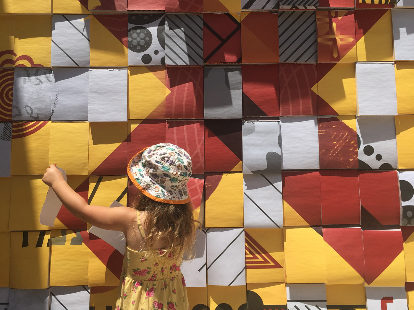
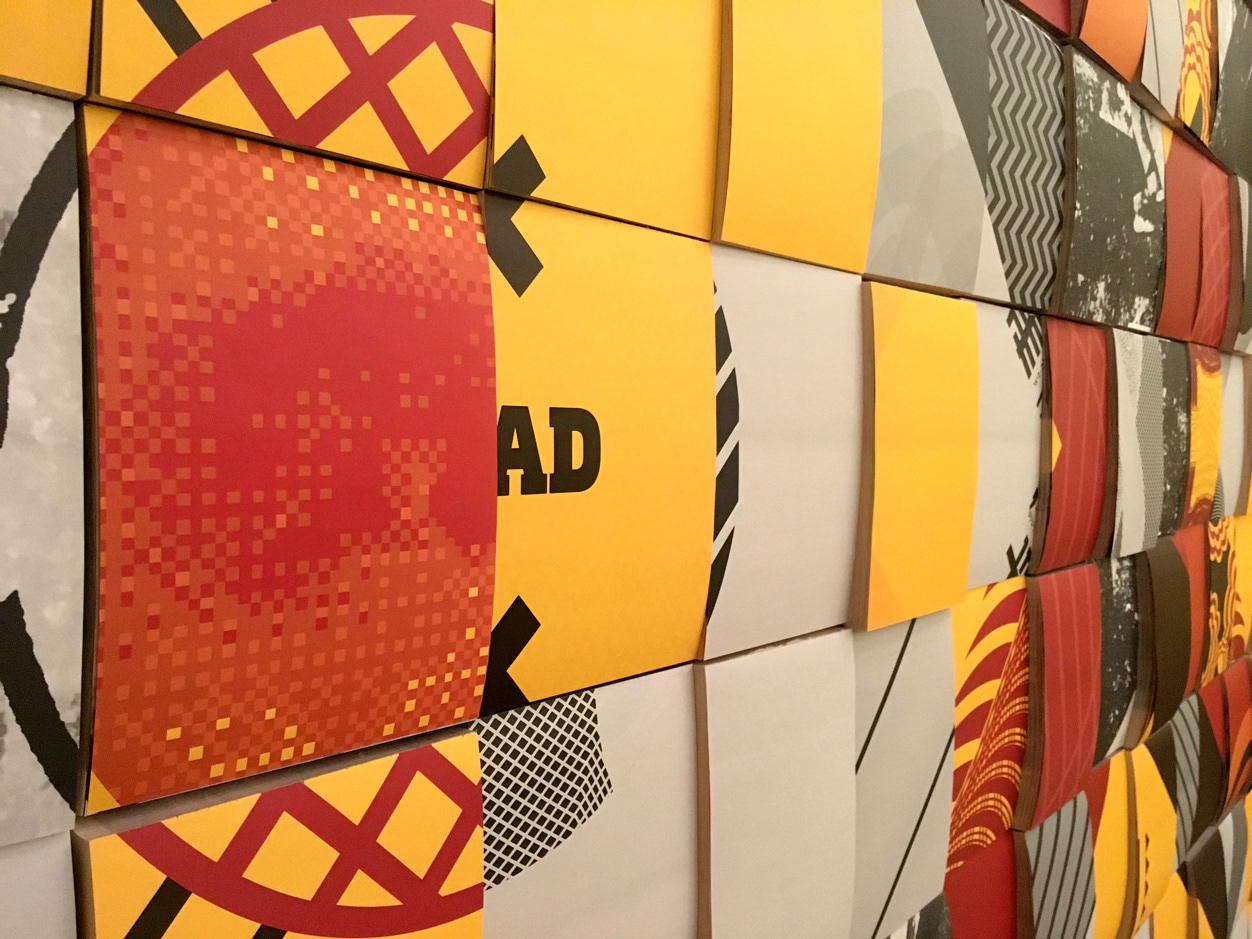
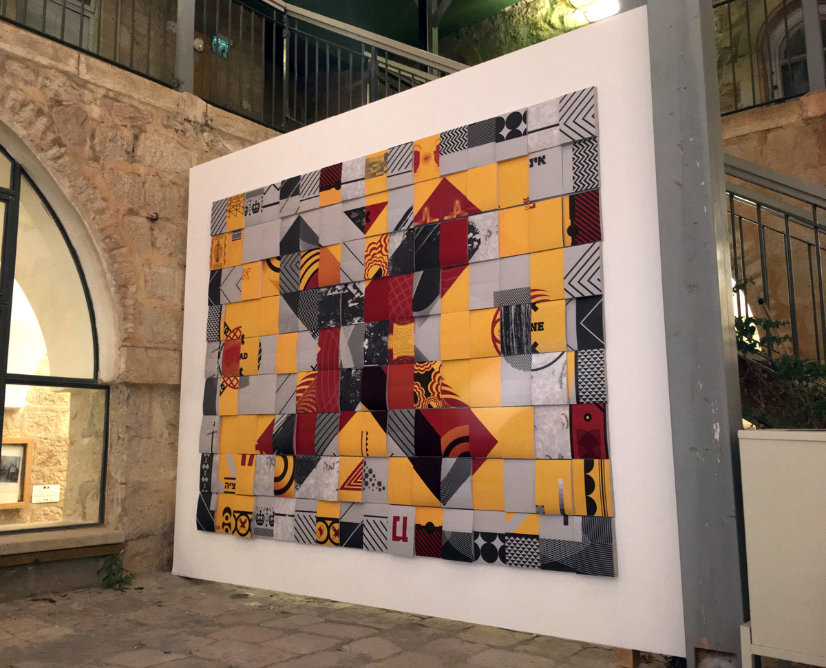
Faced with a new We Make Carpets creation made of pencils, a meticulous work of assembling individual items into one harmonious whole, Grotesca Design choose to reverse the process and dismantle dozens of images and messages in a random way, not knowing what the result will be, using 144 notepads full of images. While the carpet is in a delicate conversation with the audience and its existence depends on the separation from it, in Grotesca’s work the audience is invited to come and tear off any page they want; in fact, the work depends on this interaction. Together, both works echo an ongoing process of writing and erasing, revealing and covering.
Photography: Dor Kedmi