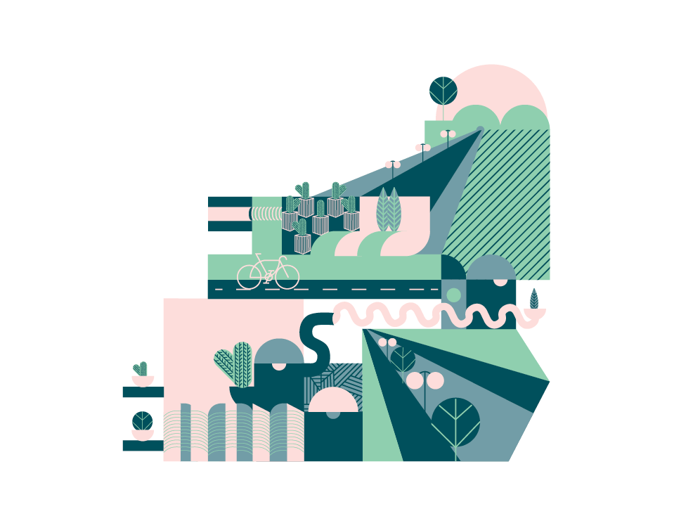
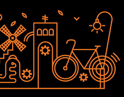
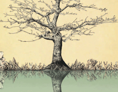
MORE FROM OUR wild LIFE

Hello World (Page 1/2)
It has been two months since we had the idea of gathering designers and illustrators from all around the world to design a peace message for everyone in the world, no matter where you live. The message is simple: it is a hello that every artist writes in their own native language and alphabet. Most countries use hello as their greeting and it is an internationally known word. Almost everyone knows what hello means, and it is a magical word that can connect people together all over. It means peace and respect to each other, but each country has their own greetings. This project is for the people. People that love each other; those that are being hurt, and those who have hurt others. Yes, why not? This is for those that may gain peacefulness from our work, and hopefully give them a moment to even their tempers and reflect on their own actions. Maybe we save a person from being hurt by others, or give a glimmer of hope to those that think are alone in this world. This is also for those who have migrated for any reason and have lost their home, family and friends, as well as those who are suffering from the effects of war.
DAYS OF LOVE FORPOETRY FESTIVAL
Booklet No. 16
string of gold
Art catalogue design
TEVA BARI
מיתוג מחדש לטבע בריא - הבריאות שלך בידיים טובות, אתר איקומרס מוביל למוצרי בריאות, תזונה וספורט . עיצבנו סט רחב של פתרונות חזותיים החלק מלוגו חדש, דרך האריזות וכלה באתר שעבר מתיחת פנים
NYLON
Branding, naming and design
MANIPULATION
Exhibition which we curated and designed at the Jerusalem Design week
Night Train to Tahrir
2016
CAMELLIA
עיצוב שפה חזותית לקמליה - מרכז יוגה, פילאטיס וגוף ונפש הפועל בקריית ענבים. הלוגו של קמליה נהנה מהמתח הפנימי הנע בין יציבות לתנועה, בין טבע לסלעיות. הרגישו איך נפתחות לכםן הצ'קרות
SHMITA
Poster
GREEN CAST
גרין קאסט הינה חברה המנהיגה מהפכה בענף הבניה: בלוקי תבנית ליציקה, החוסכים 50% מזמן הבניה. והשוס הכי גדול, אותו החלטנו להדגיש משמעותית בשפה המותגית: בניה ירוקה. מה זה אומר? גם חומר ממוחזר, גם בידוד תרמי שחוסך עלויות חימום/קירור ועוד. פיתחנו שפה הלוכדת בתוכה את שני האלמנטים החשובים של המותג, שנדמים כמנוגדים: עולם הטבע הרך מצד אחד (בצבעוניות, בסמל הצומח ועוד) ועולם הבניה הנוקשה (בקוד הטיפוגרפי, בשפה הריבועית, באינפוגרפיקות ועוד) מצד שני. בנוסף, מכיוון שהטכנולוגיית ייצור הבלוק חדשנית, יחסית לתחום הבניה השמרני, החלטנו להתכתב עם עולם ההייטק, סביבת מסך ואווירה ממשקית. וכך, כל ערכי הליבה של המותג - חדשנות, סביבתיות ואיכות - מתלכדים יחד לשפה אחת שלמה
Back to Top